
Yotpo Product – New Look & Feel
Redesigning Yotpo’s product to be cohesive, intuitive, and aligned with modern SaaS standards, this project unified the UI to strengthen the brand and enhance the user experience.
ROLE
UI Desginer
TIME
2025
The problem
Over time, Yotpo’s product suite had developed an inconsistent and outdated look and feel. Different UI patterns from different eras were scattered across the platform, creating a disjointed and sometimes frustrating experience. The design felt functional but uninspiring, with busy layouts and no clear personality.
As one user put it:
“Your admin sites are slow and confusing to navigate, they all have a different look to them, and feel outdated.”
This visual and functional inconsistency risked undermining the brand promise, reducing usability, and making it harder to compete in a fast-evolving SaaS market.
Why doing it?
We redesigned Yotpo’s product to align with modern SaaS standards, create a cohesive visual language, and reflect our brand promise across the user journey. The refresh enhances usability, makes the product more enjoyable, and signals innovation—strengthening our competitive edge and differentiation in the market
Solution
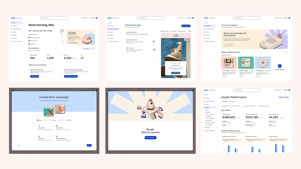
Creating a new unified design system that modernizes Yotpo’s entire product suite. The updated look and feel combines a streamlined layout, consistent spacing, and a calmer color palette to make navigation more intuitive and pleasant. Rounded elements and subtle visual details bring a modern touch, while custom illustrations add warmth and personality. This refresh not only improves usability but also reinforces Yotpo’s brand identity at every interaction—making the product feel innovative, cohesive, and unmistakably “Yotpo.”

MARKET PLAYERS
COSTUMERS WORLD

After researching competitors and the eCommerce world, I created two concepts


CONCEPT 1
This concept connects closely to Yotpo’s marketing language, adopting a more refined and minimalistic approach. The goal is to convey a powerful, enterprise-level platform—making users feel that Yotpo is a robust eCommerce marketing engine with endless possibilities to explore.
The design uses the marketing color palette sparingly, ensuring a clean, focused aesthetic that emphasizes professionalism and capability.

TYPOGRAPHIE
professional and approachable, Serif fonts paired with the sans-serif font create a balance between the professional and approachable feeling.
MOCKUPS
Present the UI in scenarios that users might encounter in real life.
TONE OF VOICE
professional tone by using industry-standard terminology such as "metrics", "recover abandoned carts", "convert repeat shoppers", "statistics". This positions us as experts in the field and assumes the merchant has some understanding already of these terms.

CONCEPT 2
This concept uses a friendly tone and design to make Yotpo feel less complicated and more approachable. A lighter color palette evokes positive emotions, creating a stronger emotional connection between users and the product.
The playful, fresh style conveys approachability, innovation, and a customer-focused mindset.
TYPOGRAPHIE
clean, simple and friendly
The design is heavily based on geometric shapes, particularly circles, which give it a modern and futuristic look. The wide structure makes it suitable for headlines and display text.
Illustrations
Isometric illustrations adds depth and dimension to the design, making it more engaging. The playful and dynamic nature of isometric illustrations can make the interface feel more interactive and game-like.
TONE OF VOICE
friendly tone by using everyday, down-to-earth language like "numbers" instead of "metrics", "almost-sales" instead of "abandoned carts", and "to-do list" instead of "recommended next steps". This makes the product more approachable and reassures the merchant that we don't assume they understand all the industry terms.
