
Yotpo.com
A complete redesign of Yotpo’s website - creating a new design language from the homepage and product pages to navigation and modular components.
ROLE
UX strategy and flow
UI design
Design/dev handoff and QA
TIME
2025
Project Overview
This project focused on redesigning Yotpo’s entire website and defining a new, scalable digital design language. I was responsible for shaping the visual foundation of Yotpo.com, including the homepage, navigation, product pages, and a full set of modular components used across the site. The goal was to create a cohesive, modern experience that reflects Yotpo’s position as a leading eCommerce SaaS platform while improving clarity, usability, and brand consistency.
The Challenge
Yotpo’s existing website lacked visual and experiential cohesion. Over time, different UI patterns and styles were introduced, resulting in an interface that felt inconsistent, busy, and outdated. The site did not fully communicate the innovation behind Yotpo’s products or support a clear storytelling flow. This made it harder for users to quickly understand the product offering and weakened the overall brand perception.
Design Approach & Principles
The design approach focused on clarity, cohesion, and modern SaaS standards. I introduced clearer visual hierarchy through typography and layout, increased spacing to reduce visual noise, and defined a calmer, more cohesive color palette. Rounded UI elements and refined details were used to create a modern yet approachable feel, balancing professionalism with warmth. The result is an interface that feels cleaner, easier to navigate, and more aligned with Yotpo’s brand values.

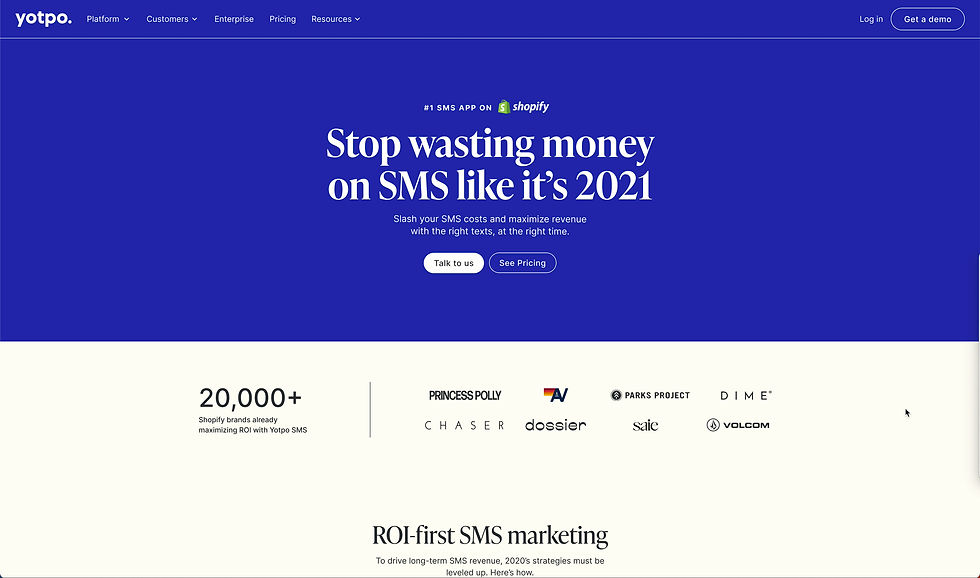
HOME PAGE
The homepage was redesigned based on extensive competitor research and product thinking around first-time and returning users. From a product perspective, we defined what information users need at each stage of the journey—brand credibility, product clarity, and proof of value and structured the page accordingly. From a design perspective, this resulted in a clear hierarchy, strong visual rhythm, and modular sections that balance storytelling with conversion.
Elements such as brand logos, product overviews, case studies, and brand video were intentionally placed to guide users through Yotpo’s ecosystem in a way that feels intuitive, scalable, and visually cohesive.

MENU
The navigation was redesigned to balance usability with business needs. Content was reorganized into a clear hierarchy that supports fast scanning and easy discovery, while still allowing flexibility to promote key assets, campaigns, and priority pages. Quick access to RAD was built directly into the menu, enabling frequent users to reach it instantly. The result is a navigation system that supports growth, marketing goals, and efficient user flows without compromising clarity.

PRODUCT PAGES
The product pages were redesigned with a strong product mindset, focusing on helping users quickly understand what each product does, who it’s for, and why it matters. All product pages were built on a shared structural foundation, with variations expressed through content and imagery rather than layout changes. This required a highly modular and flexible system that could support a wide range of products while maintaining consistency and clarity.
From a UX perspective, the content progressively reveals complexity—starting with a clear value proposition and moving into benefits, features, and proof points. From a design perspective, consistent layouts, visual hierarchy, and reusable components help simplify complex SaaS offerings, support scalability, and enable faster iteration over time.

PAGE BUILDER TEMPLETS
The page builder was designed as a flexible, modular system that enables teams to create, customize, and scale pages independently while staying fully aligned with the brand and design system. From a product perspective, a major focus was creating the most efficient and intuitive workflow for marketing teams working closely with designers allowing both to collaborate seamlessly, move fast, and iterate without friction. From a design perspective, each component was built to be reusable, adaptable, and content-agnostic, supporting a wide range of use cases.
