
Walk Away
product experience designed to showcase Yotpo Email, translating a complex email solution into a clear, intuitive, and conversion-driven journey.
ROLE
UX strategy and flow
UI design
Design/dev handoff and QA
TIME
2025
Overview
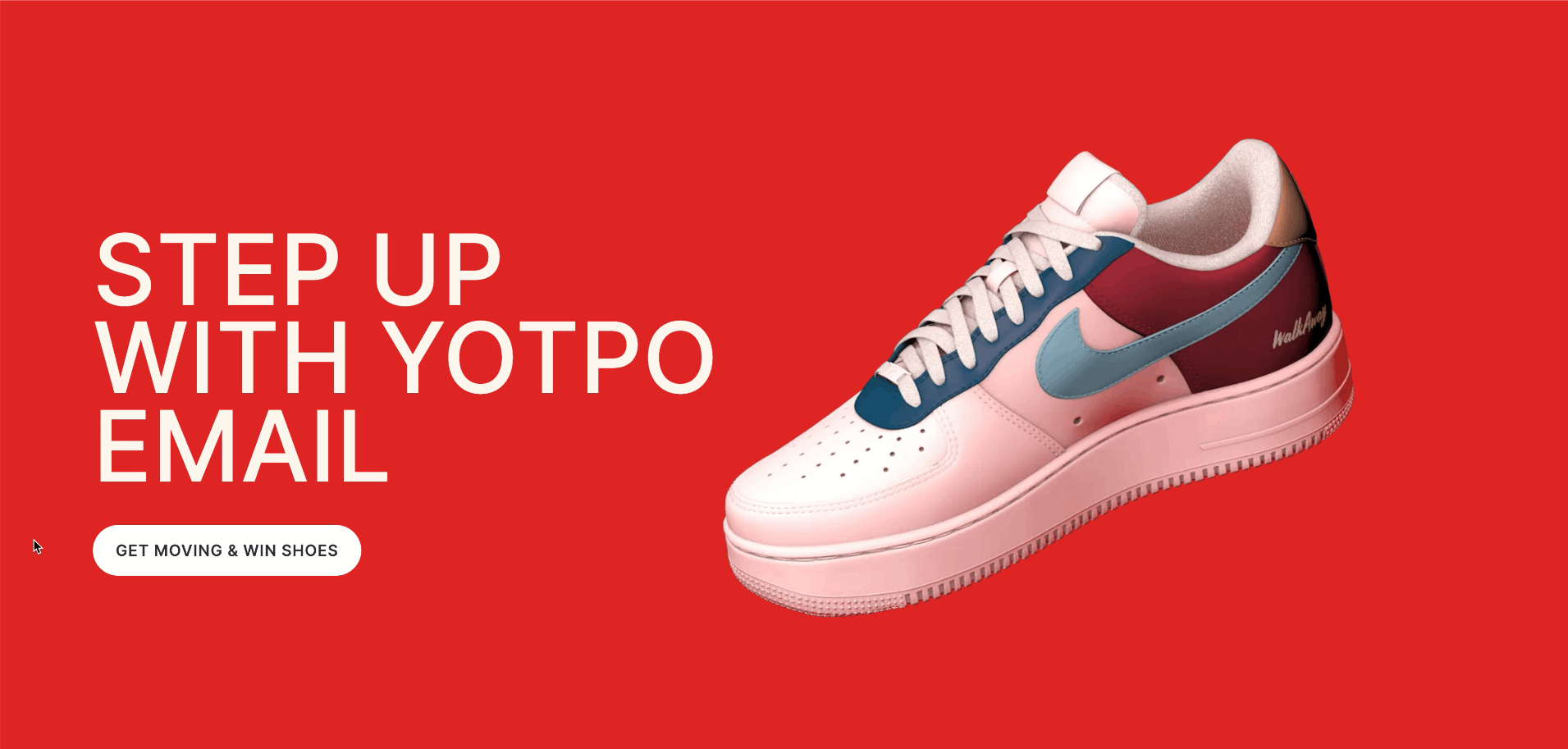
Walkaway is a focused product experience designed to showcase Yotpo Email as a powerful, intelligent solution for recovering abandoned carts and re-engaging shoppers at the most critical moment. The project translates a complex email product into a clear, persuasive, and action-driven web experience that speaks to both marketers and decision-makers. The goal was to balance storytelling, product clarity, and conversion—while staying aligned with Yotpo’s broader brand and product ecosystem.
The Challenge
From a product and design perspective, the main challenge was presenting a sophisticated email solution in a way that feels approachable, actionable, and immediately valuable. Email marketing—especially around cart abandonment—can easily feel technical, crowded, or generic. The experience needed to clearly communicate how Walkaway works, why it’s different, and how it drives real results, without overwhelming users or relying on heavy explanations.
Another challenge was creating a standalone experience that still felt native to Yotpo’s product suite. The page had to function as both a marketing entry point and a product touchpoint, bridging high-level value with concrete functionality.

The experience was designed around a clear user journey: understanding the problem, discovering the solution, and visualizing real-world impact. Each section was intentionally structured to answer a specific user question—what Walkaway does, how it works, and why it’s better than traditional abandoned cart emails.
From a product mindset, the focus was on reducing cognitive load and guiding users through the story in a logical, progressive flow. Instead of listing features, the content and layout emphasize outcomes, automation, and intelligence—positioning Walkaway as a smart system working in the background, rather than another tool users need to manage.
The project focused on creating an interactive experience that clearly conveys the concept and brings it to life, allowing users to intuitively understand the product’s value through engagement rather than explanation.


Visually, the design supports clarity, confidence, and momentum. The layout uses strong hierarchy, generous spacing, and focused sections to keep attention on the core message. Motion, illustration, and UI elements are used selectively to explain product behavior and reinforce the idea of automated, real-time decision-making.
The design language aligns with Yotpo’s broader system while allowing this product to have its own distinct presence. Color, typography, and visual rhythm were carefully balanced to feel energetic and conversion-oriented, without losing the credibility and maturity expected from a B2B SaaS product.
